Websites don’t always get the attention they deserve. Like a trusty car or a favorite sweater, websites can become something we take from granted – they’re getting the job done, even though they might have a rattle or two, or a hole in the elbow.
But here’s the thing, more and more, websites are vital to business, and their design and navigation – if not done right – can be a detriment to your association’s image, and put a dent in your bottom line.
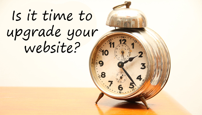
There’s no time like the present to think about updating your association’s website. Ask yourself these questions to take stock of your current site and decide: Is it time for a website upgrade?
1. Are you rocking a mullet? Rule of thumb for websites is a refresh at least every three years, if for no other reason than to keep pace with changes in technology, functionality, and navigation. If it has been more than three years since you last made any major changes, chances are you don’t look your best.
2. Does this website make me look fat? As your association evolves and your industry changes, it’s critical that your website accurately reflects the new you. Your site is your first connection to your members – and prospective members – a place for them to find the latest industry news and stay abreast of the latest benefits of membership. Make sure you leave an impression that reflects you at your best.
3. Can I get this “to go” please? There are few things more frustrating than trying to find information on a website that isn’t designed for mobile devices. Your members live life at a fast pace, and they want to be able to get updates, register for conferences and events, buy products and services, pay dues, renew memberships at any time, from any device.
4. Can I get there from here? In addition to boasting well-written content and carefully curated images, your website must be easy to navigate. It should be laid out in a logical format that highlights your most important information but also provides a depth of information that is easy to explore. As an example, new member services and programs should be front and center with a direct link to a registration or subscription page.
5. Was it something I didn’t say? If a review of your website analytics shows short visit times, high bounce rates, or even pages with low traffic, those are signs that either your content or your navigation isn’t serving you well.
6. Can you give Clark Kent a run for his money? Within the design of your website, you should have the ability to make quick changes – update a story, post a news release, publish a new issue white paper or profile an industry executive.
7. Are you #social? If Facebook, Twitter, and LinkedIn are part of your overall marketing strategy, they should be dynamically connected to your website, and deliver a consistent branding message.
8. Our members said WHAT??? If you are hearing the same questions repeatedly from members – even though the answer is on your site – or rumblings of long load times and wonky tech issues, you aren’t meeting their need for fast, easy, and direct information.
Safe to say the wrong answer to any one of these questions should be enough to consider an update. Your website is the chance to tell your story, attract new members, impress current members and to provide a user experience that is positive and responsive. On the backend, it can be a vital tool for your staff as they plan and execute events and design new member benefits, and an up-to-the-minute reflection of what your members want to know.
Coming up next…. How to pick the right web design company.